GIS & REMOTE SENSING
Contact Info

ALICE LEE
gEOGRAPHY: DATA SCIENCE
@ University of Washington
gis
Using qgis / Arcgis pro
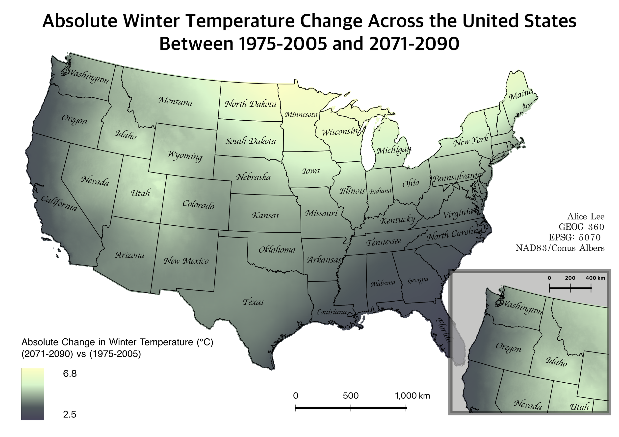
q1. how is climate change distributed across US?
Date of creation: 02/07/2026
Date of creation: 01/23/2026
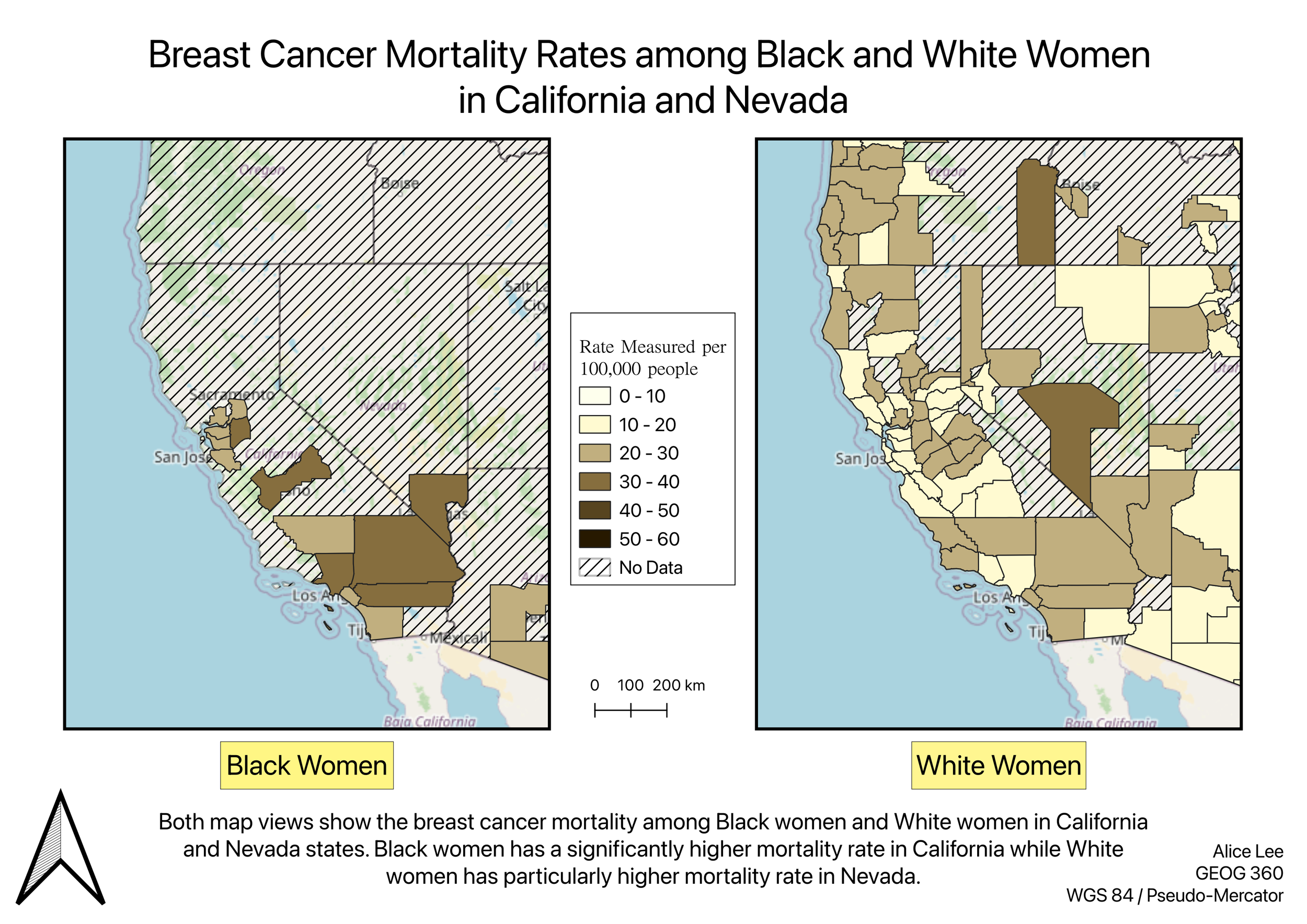
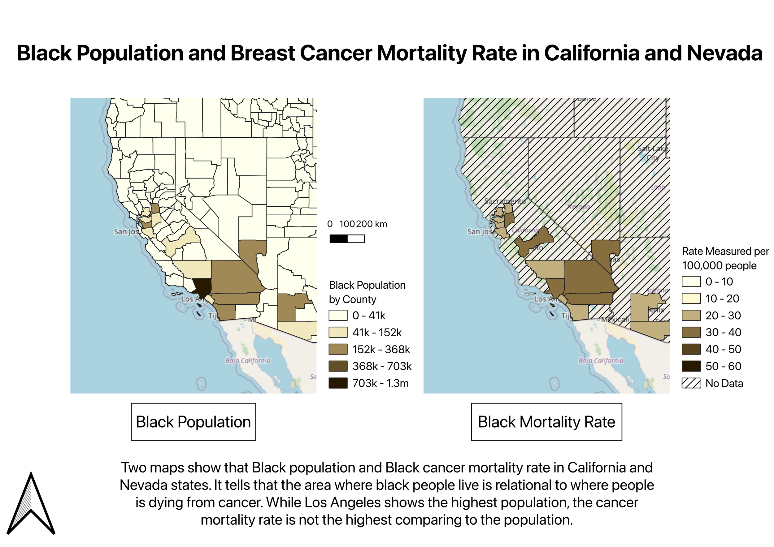
q4. how are breast cancer mortality rates distributed geographically and by race?
Date of creation: 02/13/2026
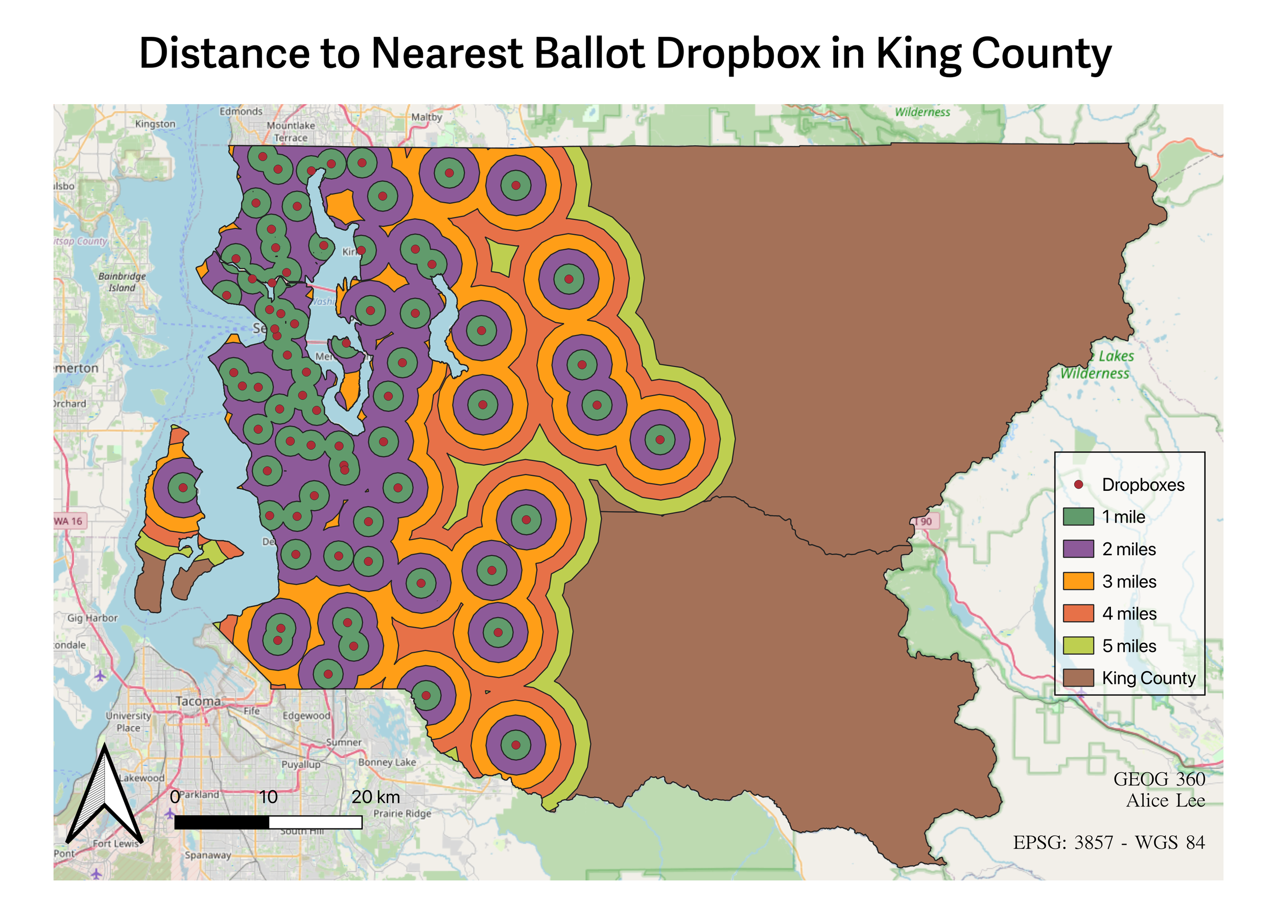
q5. how well distributed are the king county ballot dropboxes?
Click here for more details of these projects
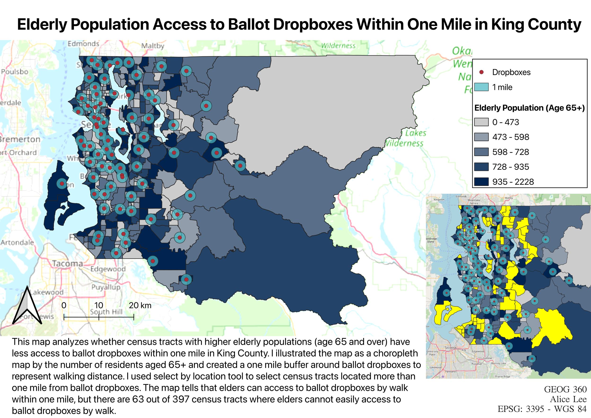
This map analyzes spatial accessibility to ballot dropboxes in King County, with a focus on whether census tracts with higher elderly populations (age 65 and over) have adequate access within a one-mile walking distance. A choropleth map is used to represent the distribution of the elderly population across census tracts, while one-mile buffers around ballot dropboxes indicate areas of accessible walking distance. A spatial query (Select by Location) identifies census tracts located beyond one mile from the nearest drop box, highlighting areas with limited accessibility. The results show that many urban areas around Seattle are within one mile to dropbox, while accessibility decreases in less densely populated areas. There are 63 out of 397 census tracts where elderly residents may not have convenient access to a ballot dropbox within walking distance. By comparing the spatial distribution of elderly populations with access buffers, the map reveals that some areas with relatively higher elderly populations are located outside accessible zones. This suggests potential inequities in access to voting infrastructure, particularly for populations that may have limited mobility. q. how does the proportion of residents living within 0.5 miles of a park vary
across Seattle census tracts with different racial compositions?
Data Sources:
Seattle Parks And Recreation Park Addresses
https://gis-kingcounty.opendata.arcgis.com/
2020 Census State Redistricting Data - Total Population for Tracts
https://gis-kingcounty.opendata.arcgis.com/
2020 Census Tracts for King County - Major Waterbody Features Removed
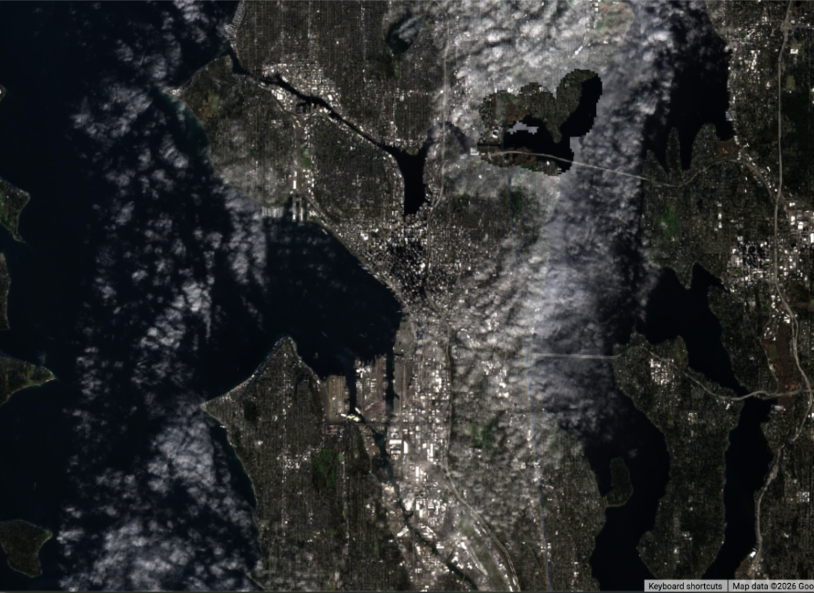
Winter 2025 Sentinel-2 True Color Image of Seattle, Washington
#2: seattle building permits
Date of creation: 02/21/2026
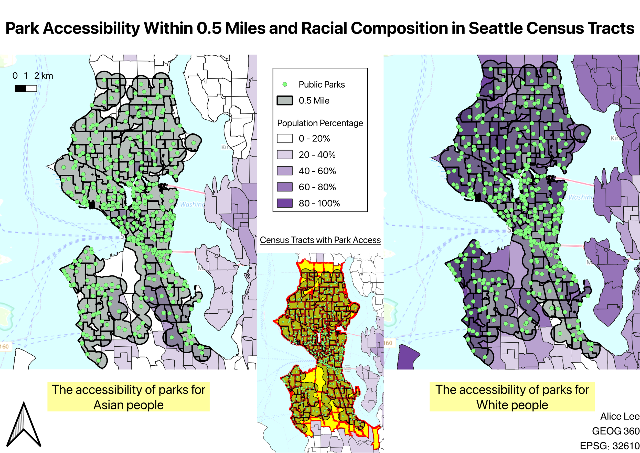
Parks provide communities with opportunities for recreation, social interaction, and improved mental health. However, access to parks is not always evenly distributed across neighborhoods. While some residents have parks within walking distance, others experience limited access. This project examines how the proportion of residents living within 0.5 miles of a park varies across census tracts in Seattle, with a focus on differences in racial composition.
Methodology:
First, a 0.5-mile buffer was created around park locations to represent a reasonable walking distance. Buffers were dissolved to produce a continuous accessibility area across overlapping park service zones. Next, census tract boundaries were clipped using the buffer layer to isolate areas within walking distance of parks. A spatial query (Select by Location) was then used to identify census tracts that intersect with park service areas, allowing for classification of accessible versus less accessible regions. Demographic data were integrated using a spatial join based on GEOID identifiers. During this process, field types were standardized using the field calculator to resolve spatial join errors and prevent null values. Additional variables were created to calculate the percentage of White and Asian populations, enabling comparison between park accessibility and racial composition.
Result:
The analysis indicates that a large proportion of census tracts in Seattle fall within 0.5 miles of a park, suggesting generally high accessibility to public parks. This reflects the widespread distribution of parks across the city. However, spatial patterns reveal variation in accessibility when examined alongside racial comparison. Some census tracts with higher proportions of certain racial groups are located closer to park-dense areas, while others are relatively farther from accessible park areas. The results suggest that although overall park access is high, accessibility is not uniformly distributed, and disparities exist across neighborhoods. These patterns highlight the importance of considering equity in urban planning and the potential development of transportation systems.
Date of creation: 03/11/2026
#1: Symbolizing cities by number of nearby national parks
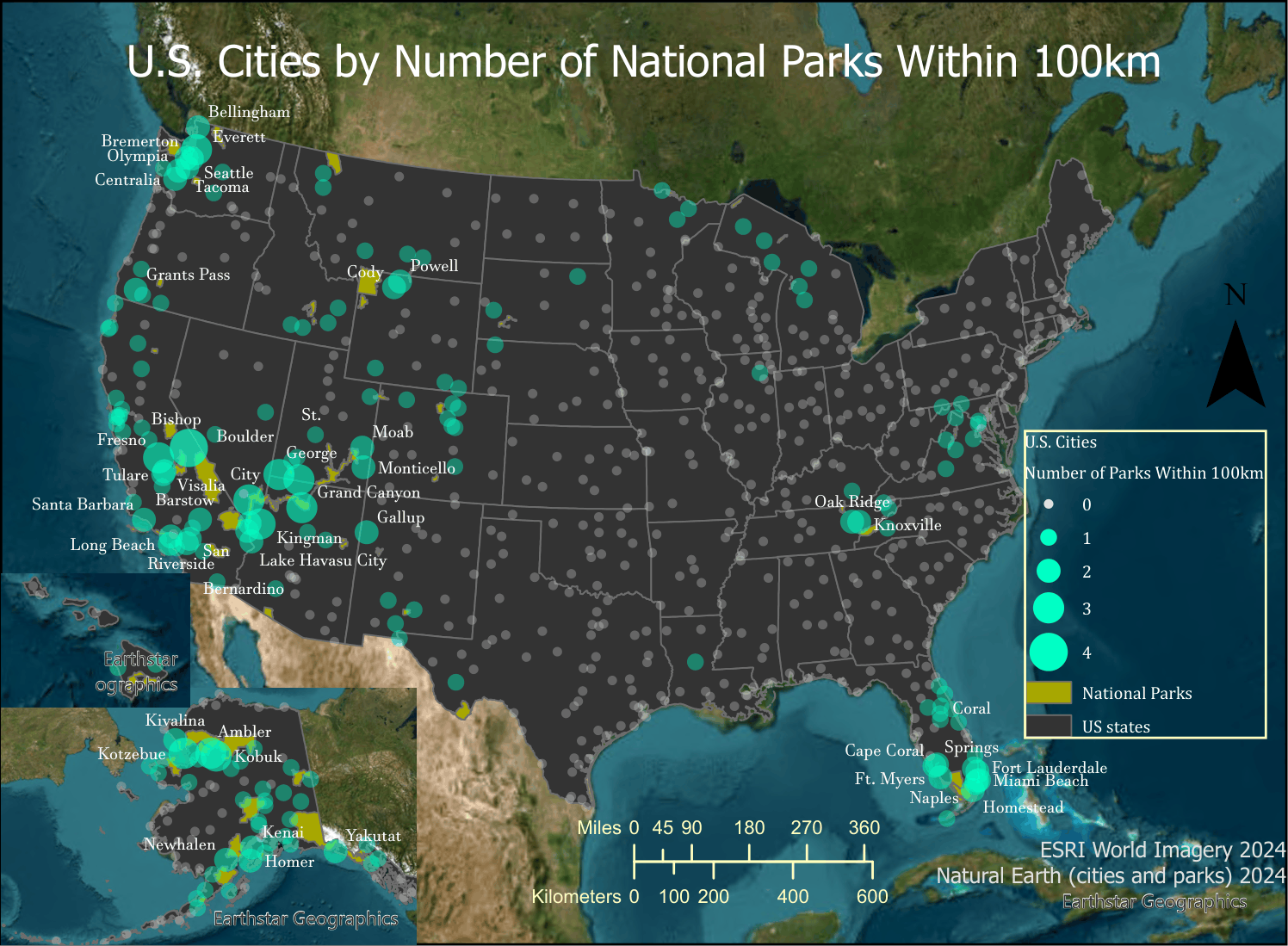
The map illustrates how many national parks are within 100km in U.S. cities by using polygons that symbolize the number of parks within 100 kilometers.Spatial Analysis:Q1.Which city has the greatest number of national parks within 100 kilometers?Bishop, CAQ2.What are the top three states according to percent of their total area that is a national park, and what is the percent of each?1. Alaska, 14.49%2. Hawaii, 8.58%3. California, 7.75%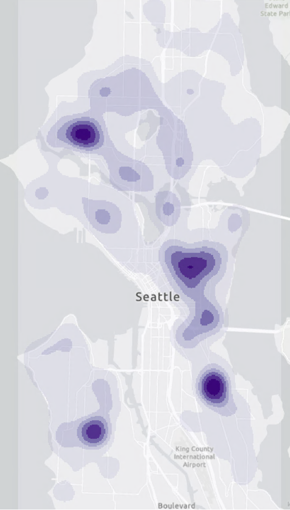
[2002 - 2013]Date of creation: 04/23/2026
[2014 - present]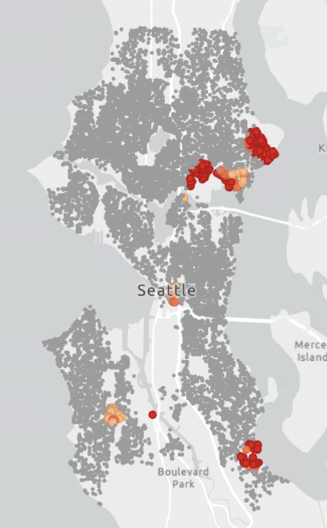
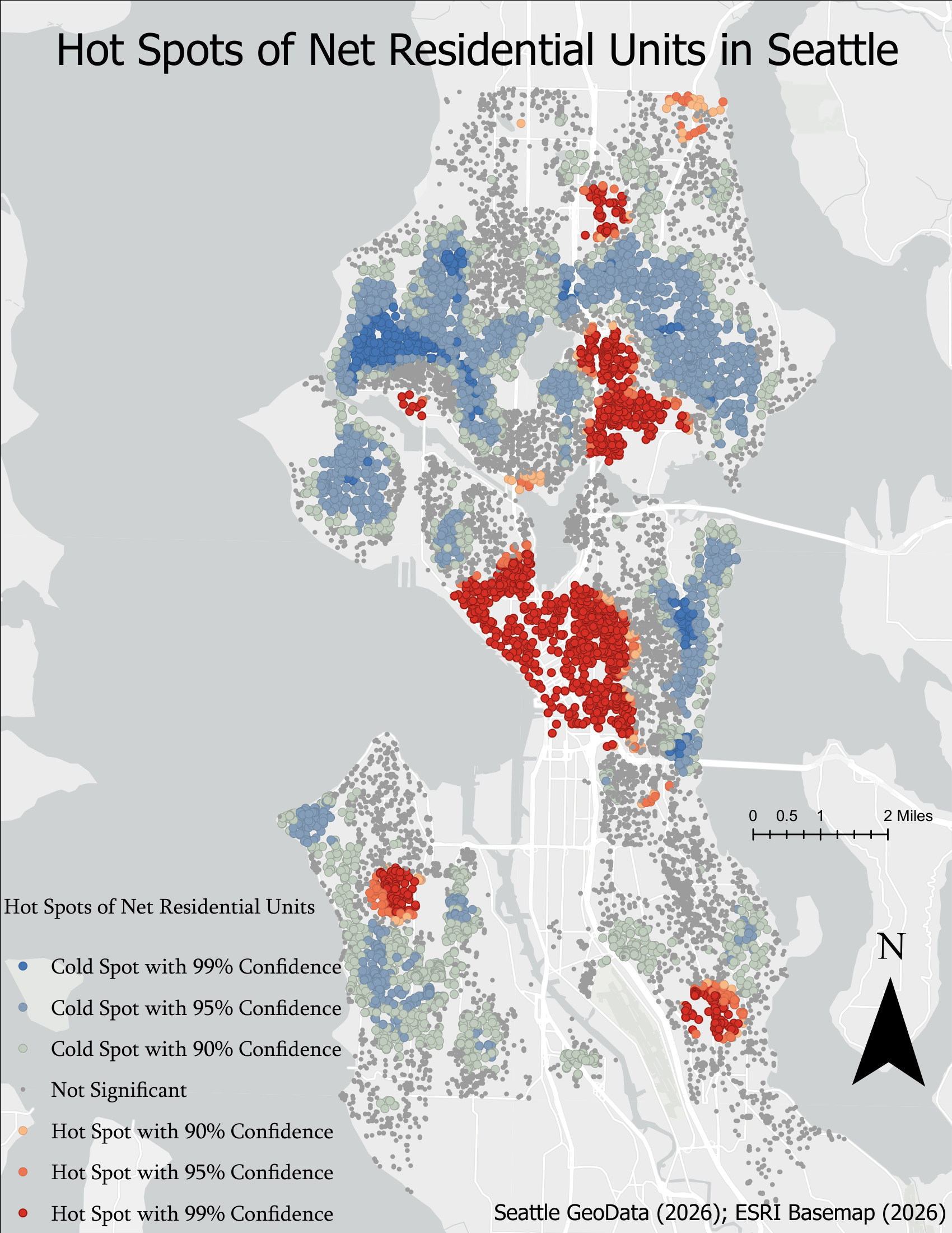
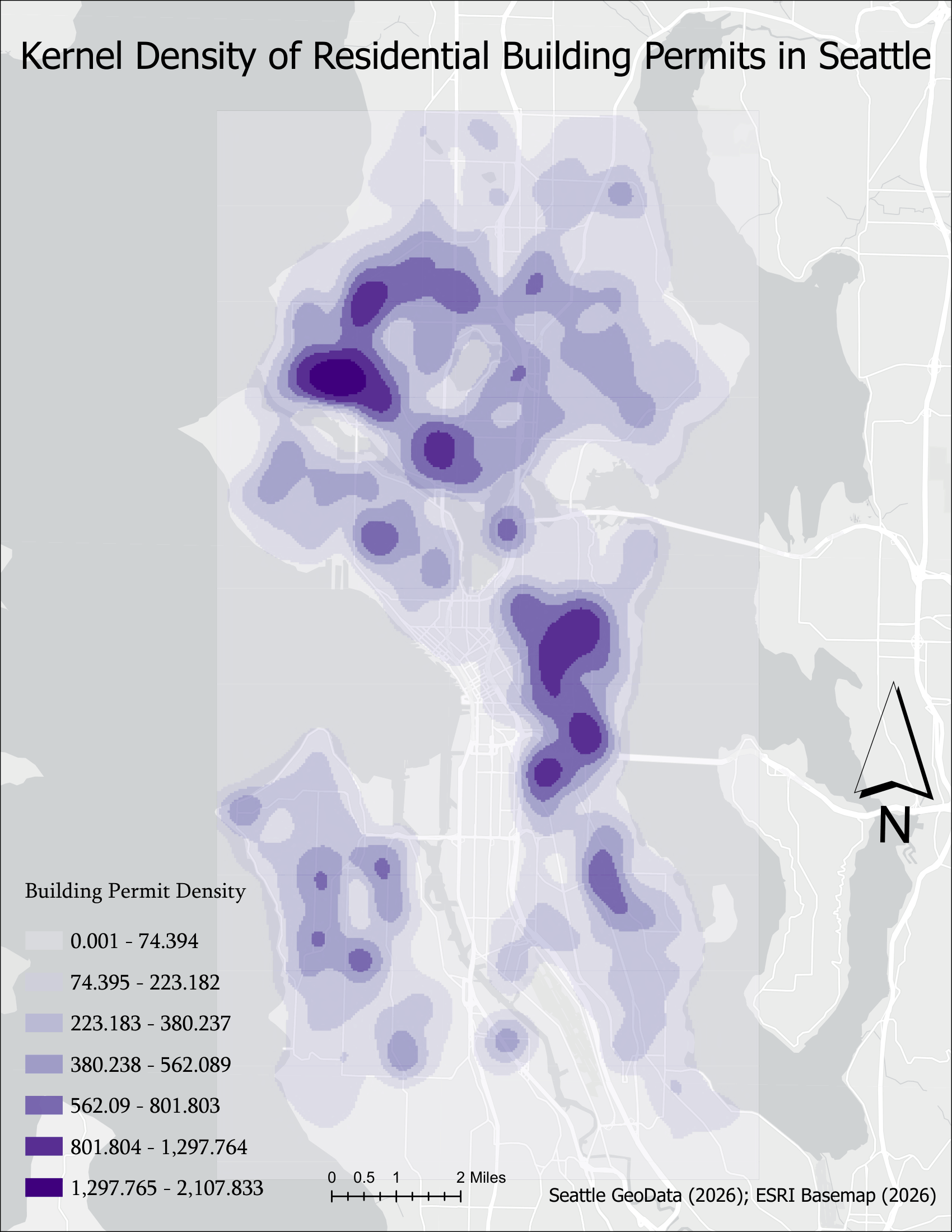
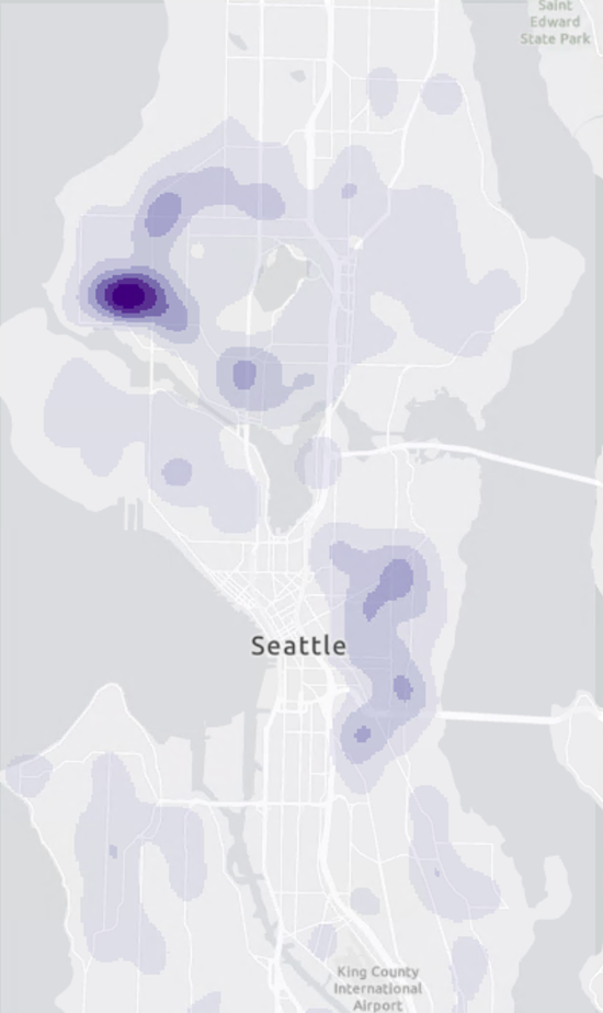
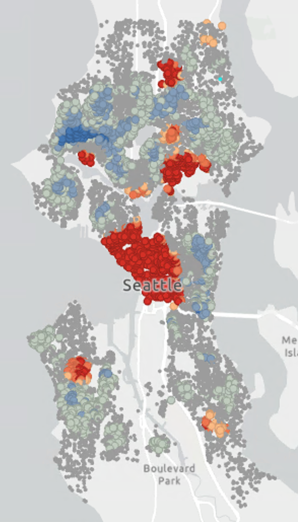
lot size hotspotsThe kernel density map and hot spot map reveal that residential building permits in Seattle over the past decade have become concentrated in particular urban areas that are surrounded by companies and transportation infrastructure. The heat map visualizes the density of building permits in Seattle that shows strong concentrations in central Seattle and northwestern parts of Seattle. Comparing the periods between 2002-2013 and 2014-present, I found that building permit activity in Seattle after 2014 has become less concentrated across the city while still being dense in northwestern Seattle. The hot spot analysis of net residential units highlights the actual density of residential development itself. The strongest hot spots are concentrated in the center of Seattle, particularly the downtown area, where a lot of buildings and companies are located. Smaller hot spots appear near the area and cold spots are located where the building permits activity is not very activated. However, comparing both heat map and hot spot map, I found that cold spots areas in northwestern parts of Seattle are where the high concentration of building permits appear in the heat map. This suggests that although many permits were issued in the area, it may have lower net residential units due to smaller scale development and other public infrastructures.#3: working with raster data: estimating the effects of sea level rise by 2100
Date of creation: 05/08/2026
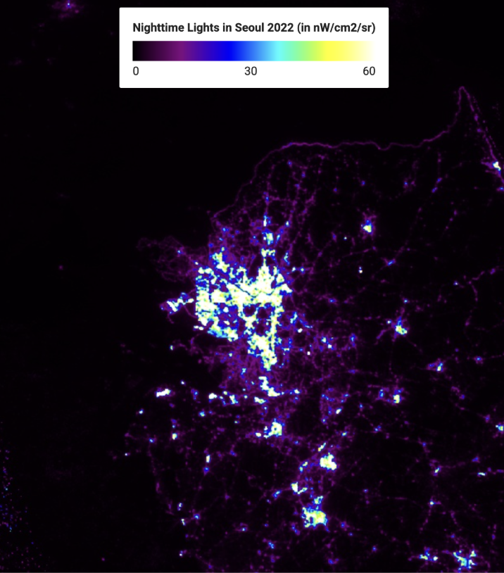
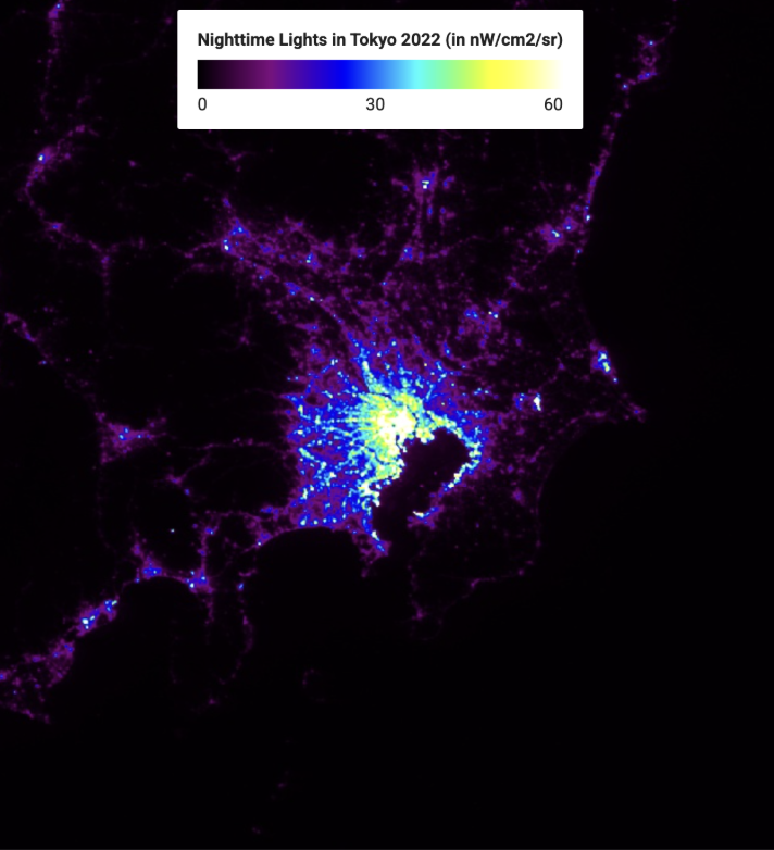
→ comparing Nighttime Light Intensity in Tokyo and Seoul Using VIIRS Nighttime Imagery from 2015 to 2022
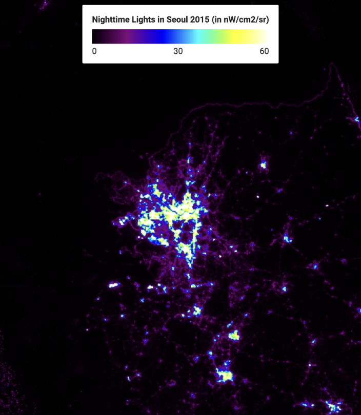
Figure 1. VIIRS nighttime light imagery of Seoul in 2015 (left) and 2022 (right). Data Source: VIIRS Nighttime Day/Night Annual Band Composites V2.1 for 2015 and VIIRS Nighttime Day/Night Annual Band Composites V2.2 for 2022
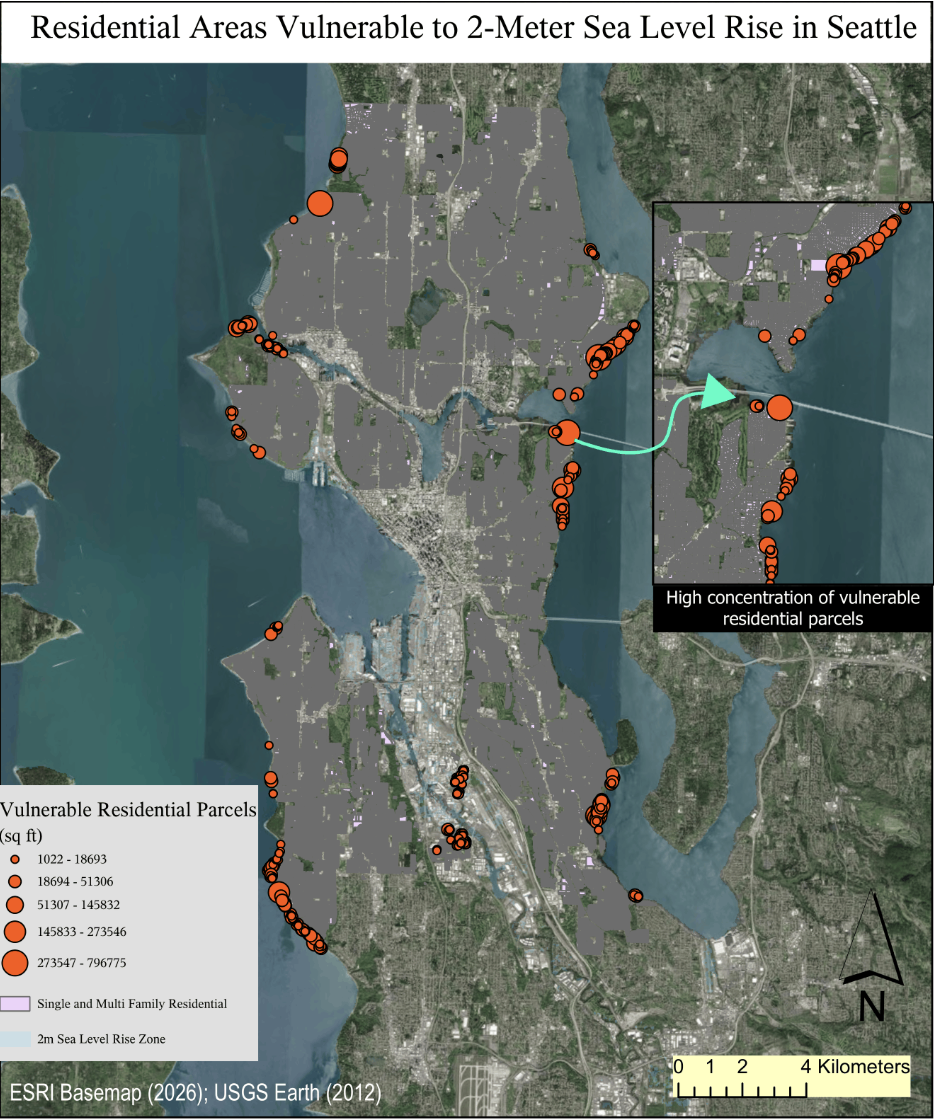
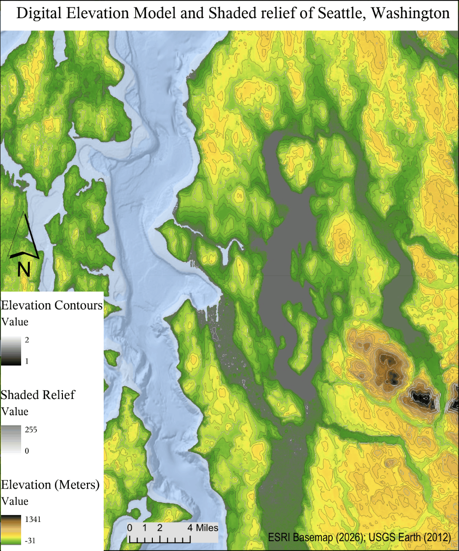
According to the NOAA Climate.gov explanation of global sea level rise, rising sea levels are primarily caused by two major processes: the melting of land-based ice such as glaciers and ice sheets, and the thermal expansion of seawater as ocean temperatures increase. By 2100, Seattle is expected to experience measurable sea level rise as a result of climate change and rising temperatures of Earth’s atmosphere.
Regarding this article, I decided to predict sea level in 2100 as less than or equal to 2 meters. A 2 meter sea level was used to model SRTM elevation data and raster analysis tools. In the result, I found that there are 482 vulnerable multi-family residential zones to 2 meter sea level and the total vulnerable area is calculated as 0.9796350575 square kilometers. The vulnerable parcels were primarily concentrated along Seattle’s shoreline and low-lying coastal areas. Areas along Elliott Bay, Harbor Island, and parts of southern Seattle showed high concentrations of vulnerable residential parcels. These locations are generally low-elevation areas closer to coastlines.
This map can assist in evacuation from natural disaster emergencies, future urban planning, and infrastructure development. It provides great information for climate research to help reduce climate risks and suggest potential solutions to the public. However, this map also contains limitations. The SRTM DEM dataset has relatively coarse spatial resolution and may not fully capture local elevation variations or small scale topographic features within Seattle.
Reference
Lindsey, Rebecca. “Climate Change: Global Sea Level.” NOAA Climate.gov, National Oceanic and Atmospheric Administration, https://www.climate.gov/news-features/understanding-climate/climate-change-global-sea-level. Accessed 13 June 2026.
Date of creation: 05/26/2026
q. Which areas within Washington Park Arboretum have insufficient biodiversity documentation
and should be prioritized for future botanical inventory efforts?
Date of creation: 06/10/2026
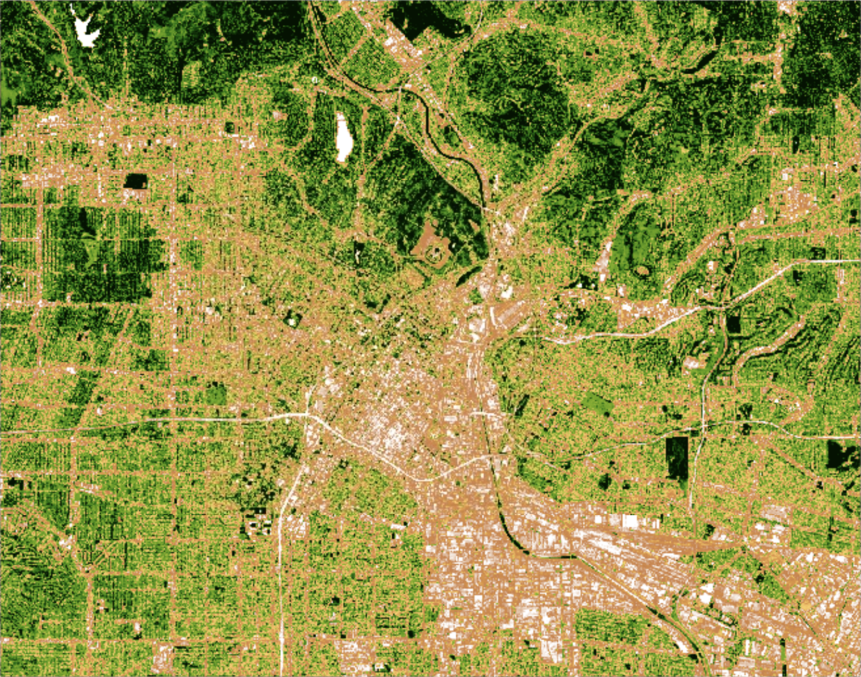
Winter 2025 NDVI Map of Seattle, Washington derived from Sentinel-2 imagery
Introduction
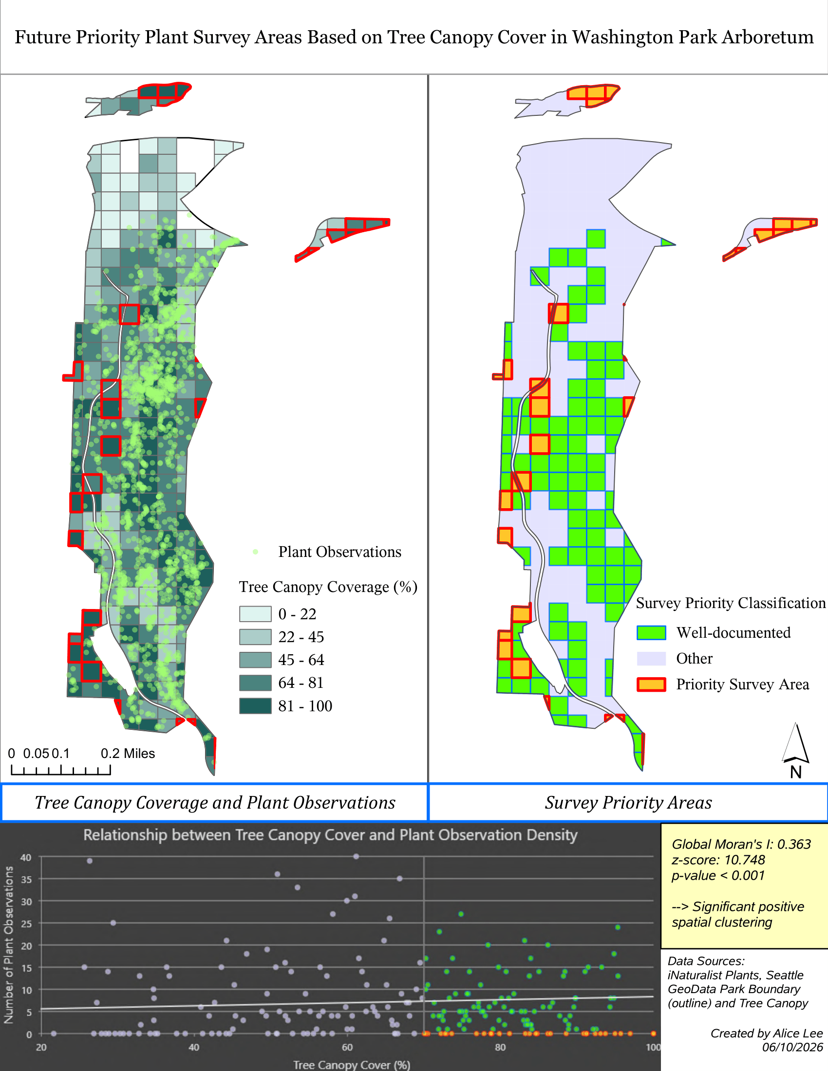
The map examines the distribution of plant observation points across Washington Park Arboretum, highlighting areas of low and high plant observation density, and analyzes the distribution of tree canopy coverage. The purpose of this project is to identify potential priority areas for future plant surveys within the arboretum. Washington Park Arboretum, located near UW campus, has gaps in biodiversity documentation that need to be addressed for future botanical survey planning. This park is a great study area because it is a living collection of hardy, woody plants, maintained for education, conservation, research, and public inspiration, according to the Trust for Cultural Landscapes Foundation (TCLF) website. Washington Park Arboretum is the region’s largest and most important botanical garden, cooperatively managed by Seattle Parks and Recreation and the University of Washington Botanic Gardens, with major support from the Arboretum Foundation (Arboretum Foundation, 2023). This project uses Tree Canopy and Park Boundary datasets from Seattle GeoData, along with Plant Observations data from iNaturalist. By integrating tree canopy and plant observation datasets, the map enables analysis of the relationship between tree canopy coverage and plant observation density to identify potential priority areas for future plant survey planning. In collaboration with the Arboretum Foundation and University of Washington Botanic Gardens, Seva led community engagement efforts involving both users and non-users to support improved future survey planning (Seva Workshop, 2023).
Analysis and Findings
In this project, I used the Create Fishnet tool to generate a grid on the map, which facilitates the identification of specific characteristics within defined areas. By dividing the Washington Park Arboretum into smaller grid cells, the map highlights distinct features within each cell, illustrating the density of features throughout the area.
The map on the left displays tree canopy coverage and plant observation density. Tree canopy coverage is visualized using a grid to represent density, while plant observations are depicted as points by converting the raw dataset into point data. According to the map, plant observation points are most concentrated in the center of the Washington Park Arboretum and in the southern areas. I observed that most regions with high tree canopy coverage also have many plant observations, although a few areas with high tree canopy percentages exhibit low observation density. The scatter plot illustrating the relationship between tree canopy coverage and plant observation density shows R2 = 0.01, meaning tree canopy explains only about 1% of the variation in observation counts. This tells that there is a weak linear relationship between tree canopy coverage and the number of plant observations within fishnet cells, indicating that the percentage of tree canopy is not strongly correlated with plant observation density. There are several grid cells with canopy cover greater than 70% containing few or no observations. These cells were classified as under-documented areas and may represent priority future survey areas, while those with at least one observation are considered well-documented. The map on the right visualizes these plant documentation gaps, highlighting where future surveys should focus. The lack of strong correlation between high tree canopy coverage and plant observation density is due to some areas having insufficient plant observations despite dense canopy cover. This spatial analysis is useful because it identifies areas of Washington Park Arboretum that may be underrepresented in existing plant observation records despite having substantial tree canopy coverage. By comparing tree canopy cover with plant observation density, the analysis helps reveal potential survey gaps that may not be apparent from observation data alone. It may be useful to botanists, ecologists, park managers, conservation organizations, and the University of Washington Botanic Gardens.
For statistical analysis, Global Moran’s I was used to assess the spatial distribution of plant observation density across fishnet grid cells. The results show a Global Moran’s I value of 0.363 with a z-score of 10.748 and a p-value less than 0.001. These indicate statistically significant positive spatial autocorrelation, meaning that plant observations are clustered in specific areas of the arboretum rather than occurring randomly. The scatterplot and statistical analysis reveal that observation efforts are spatially concentrated in certain areas of the arboretum, leaving some high percentage of tree canopy coverage areas relatively under-documented and these areas would present for potential future plant survey areas.
Remote sensng
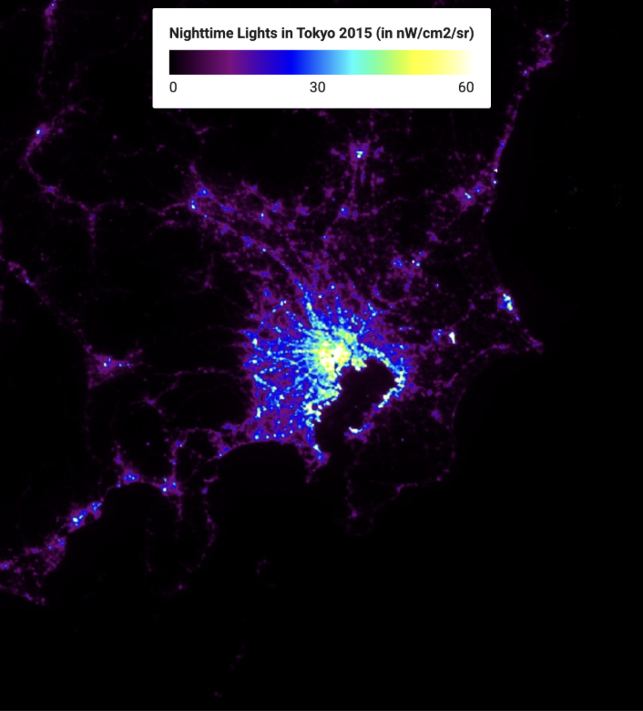
Figure 2. VIIRS nighttime light imagery of Tokyo in 2015 (left) and 2022 (right). Data Source: VIIRS Nighttime Day/Night Annual Band Composites V2.1 for 2015 and VIIRS Nighttime Day/Night Annual Band Composites V2.2 for 2022
Click here for more details of this project
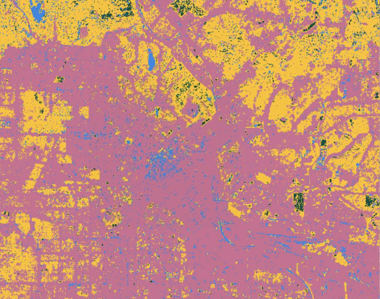
Four-Class Land Cover Classification of Los Angeles, California in 2025
Supervised land cover classification generated from Sentinel-2 imagery using four classes: urban, vegetation, water, and bare land.
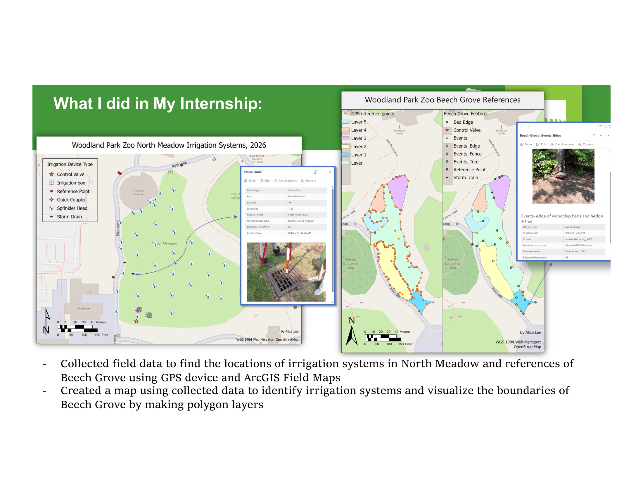
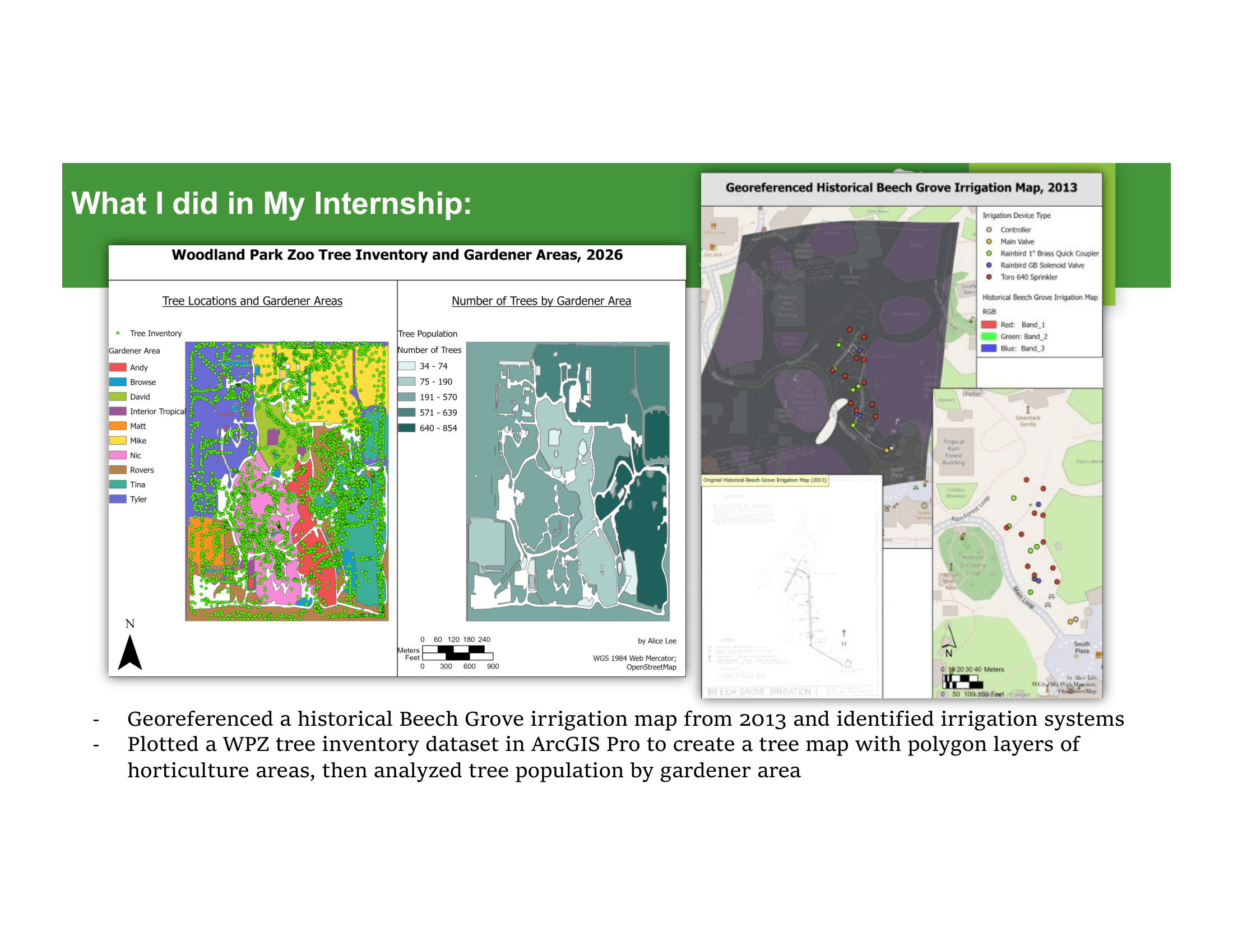
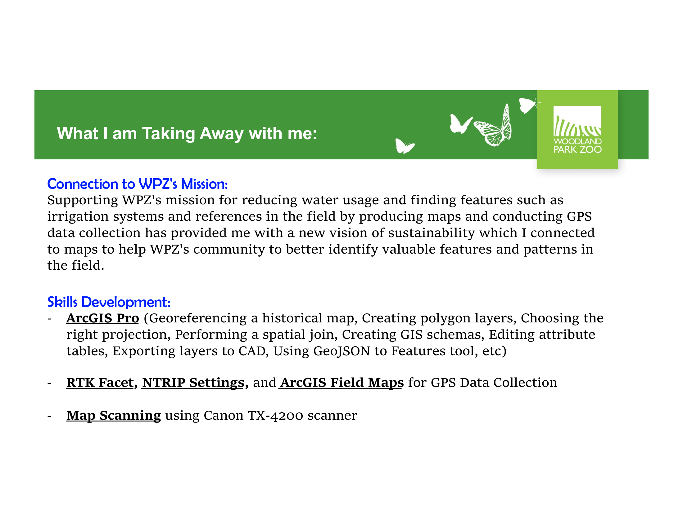
woodland park zoo internship capstone 2026
→ Visualizations for seattle, washington in winter and summer 2025
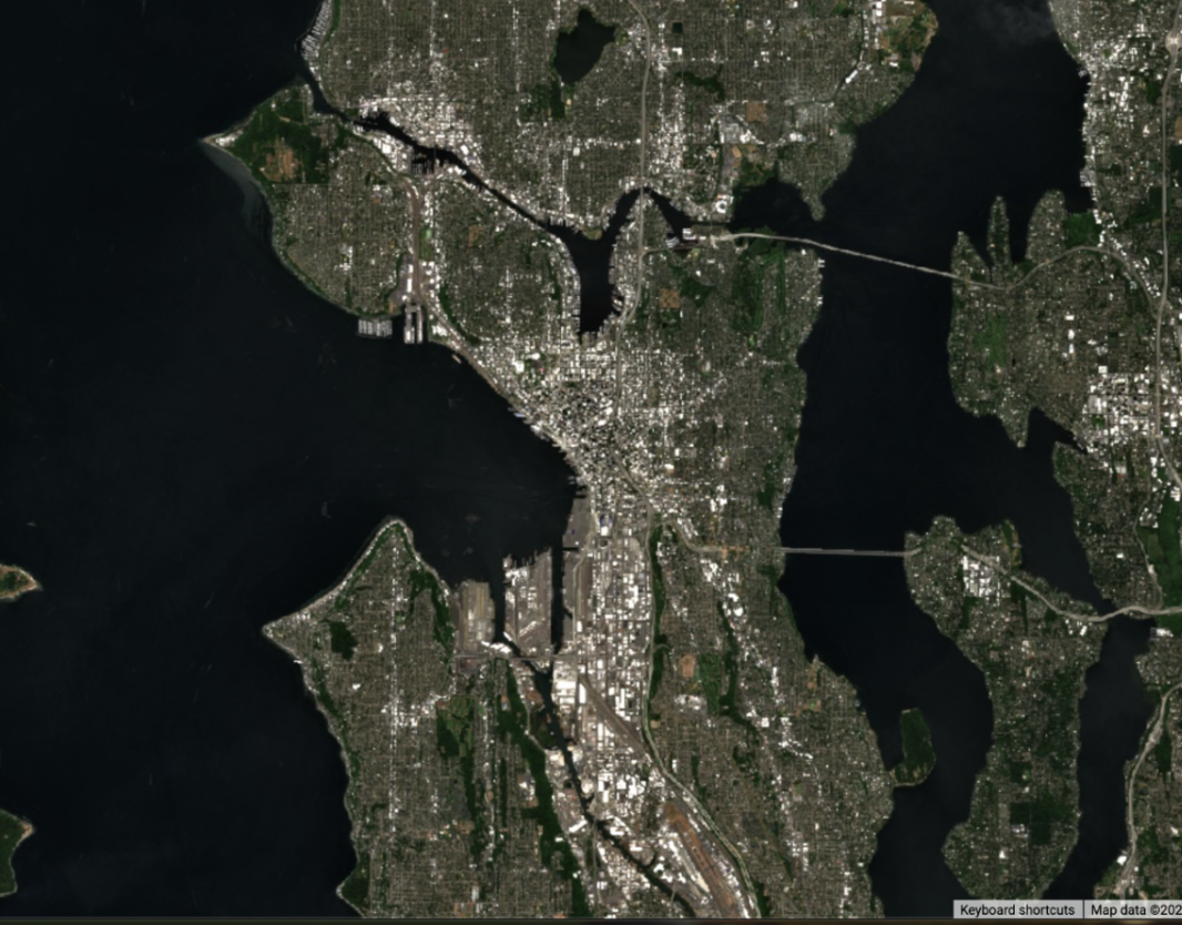
Summer 2025 Sentinel-2 True Color Image of Seattle, Washington
→ land cover classifications of los angeles, california in 2025
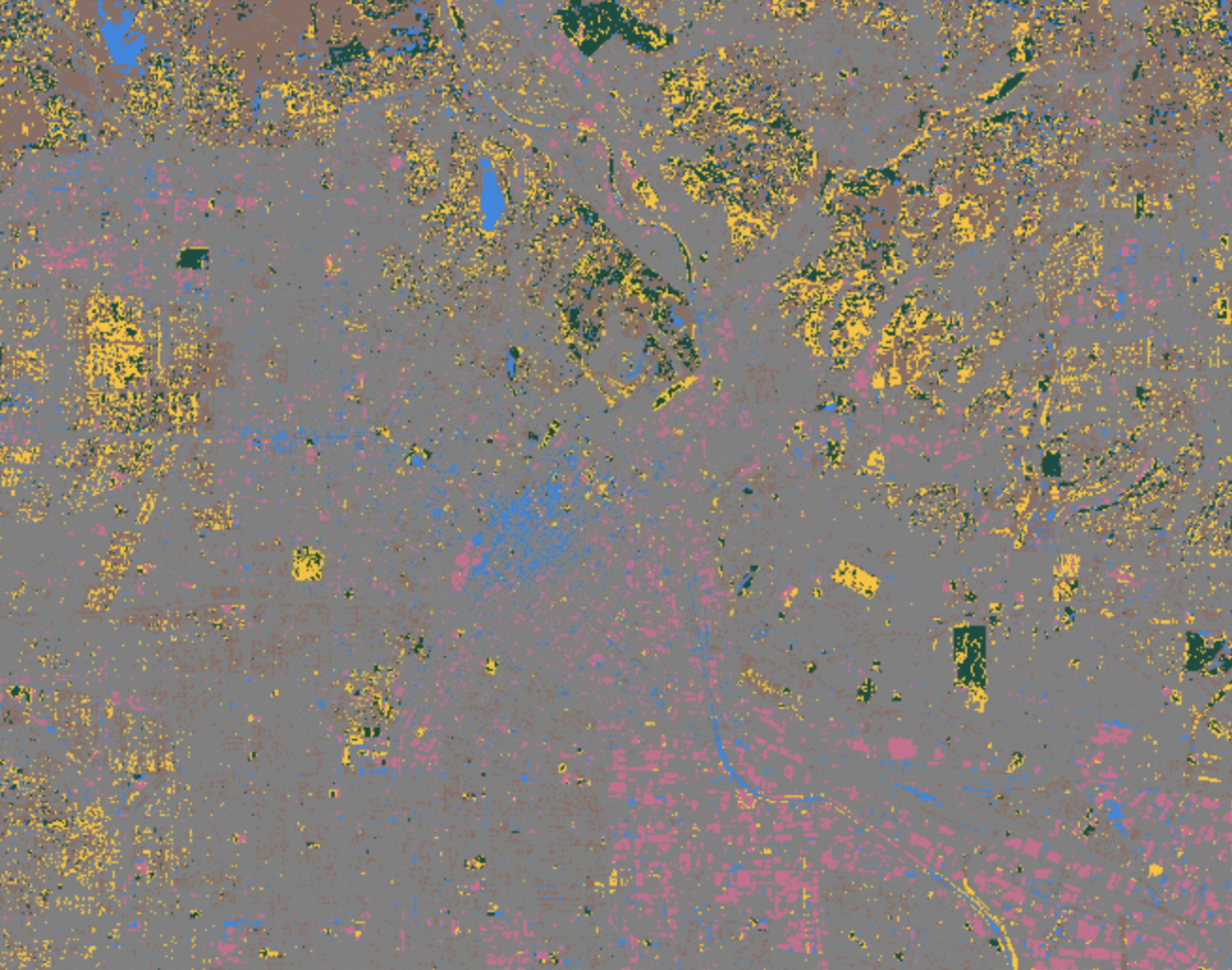
Six-Class Land Cover Classification of Los Angeles, California in 2025
Supervised land cover classification generated from Sentinel-2 imagery using six classes: buildings, roads, vegetation, dry vegetation, water, and bare land.
→ ndvi maps of seattle, washington in winter and summer 2025
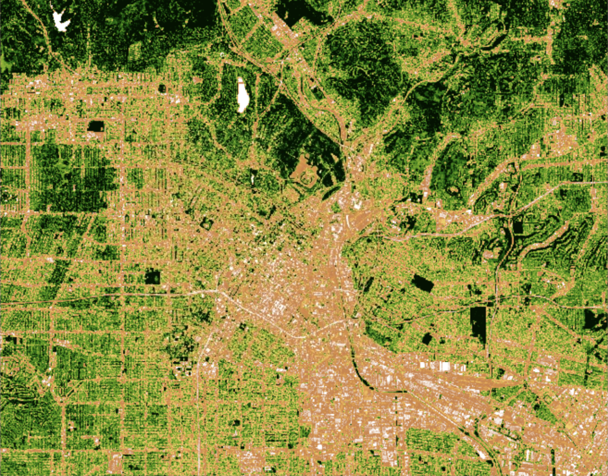
Summer 2025 NDVI Map of Seattle, Washington derived from Sentinel-2 imagery
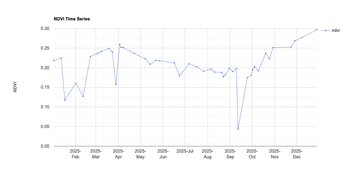
→ NDVI Time Series for Seattle, Washington (2025)
The map illustrates that winter temperatures across the United States are projected to increase between the historical period (1975 - 2005) and the future period (2071 - 2090). The use of a sequential color scheme effectively highlights the magnitude of temperature change, allowing viewers to easily identify regions experiencing greater warming. Brighter colors emphasize higher increase, reinforcing the map’s central argument. By adding an inset map, the viewers are able to see the zoomed-in specific regions that may be difficult to observe at the national scale.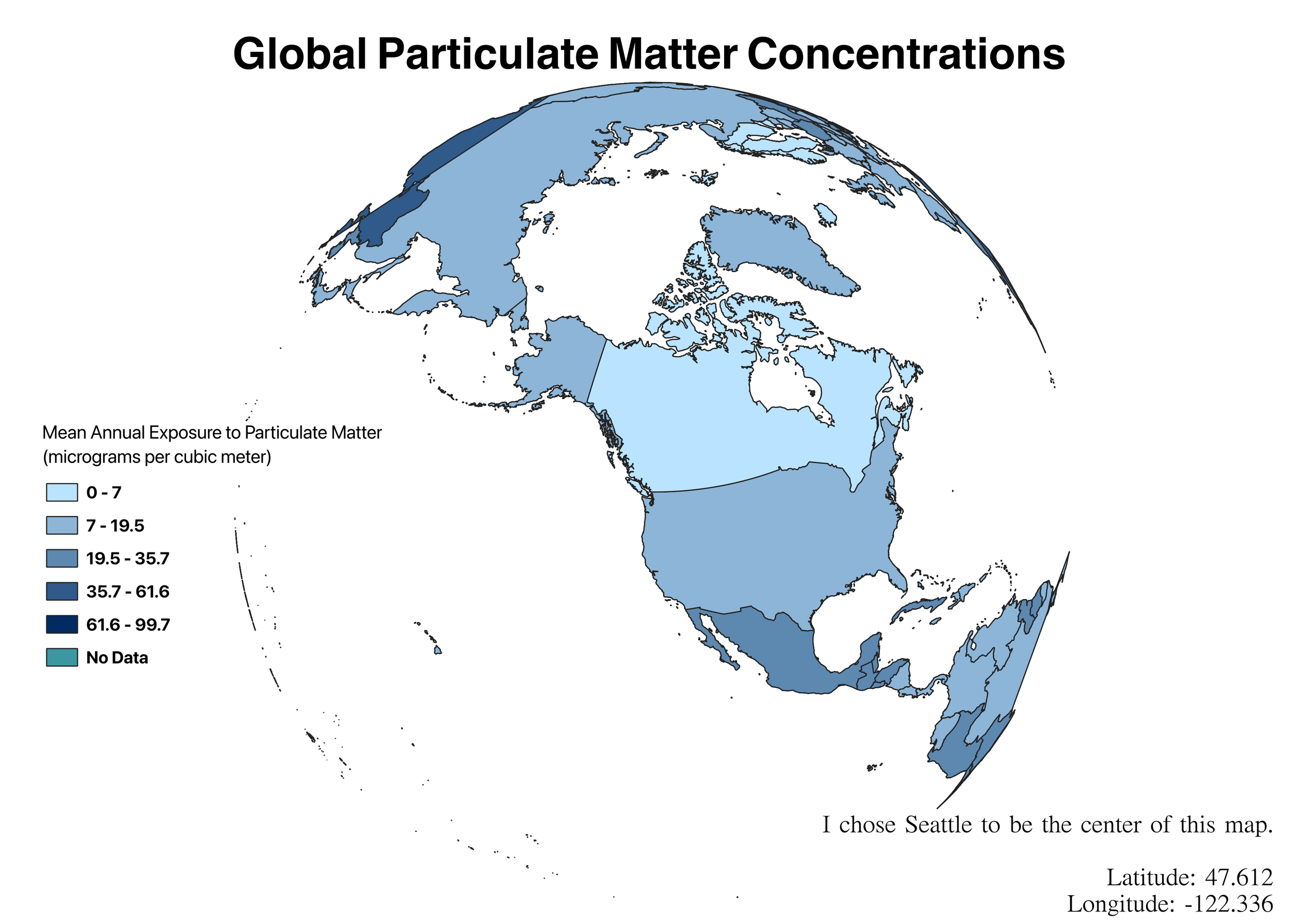
Map 3
building value hotspotsDate of creation: 01/30/2026
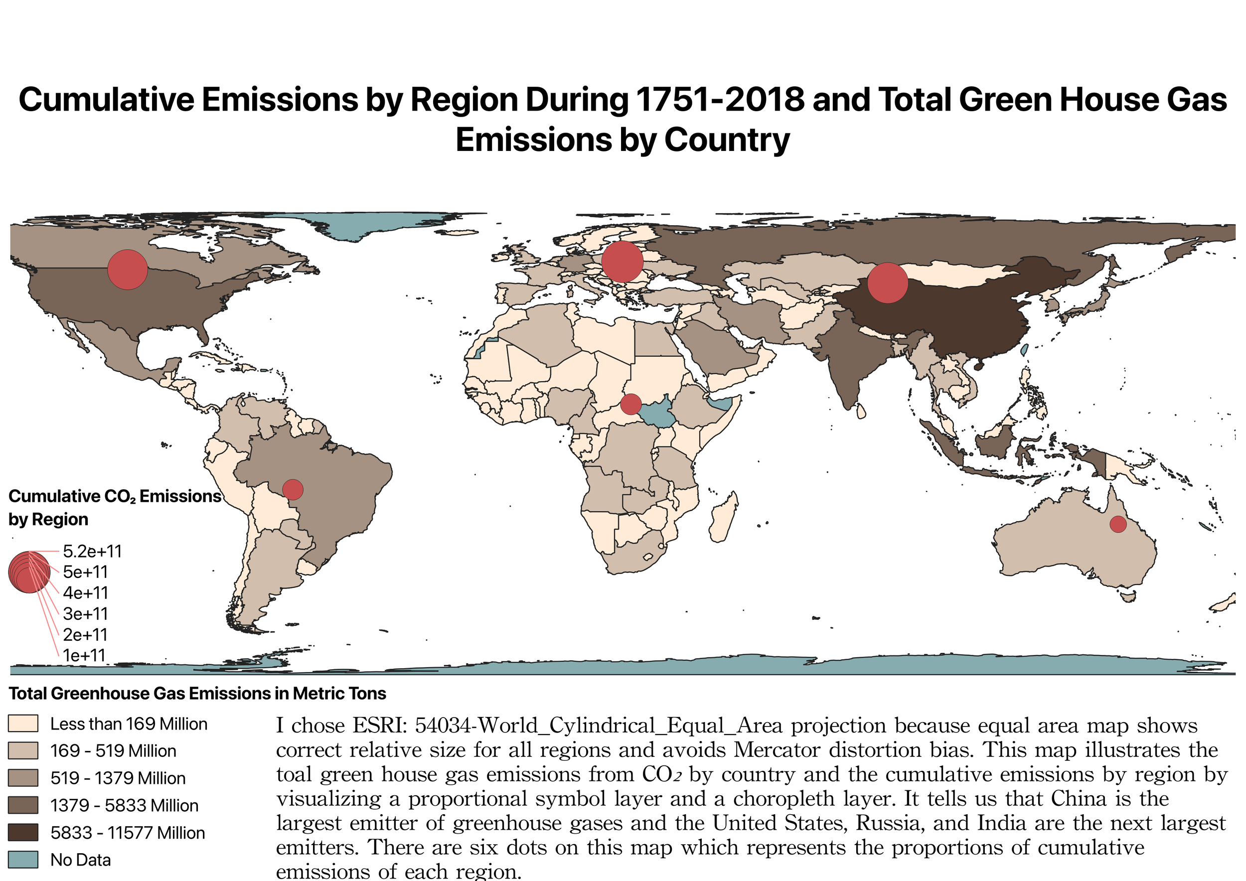
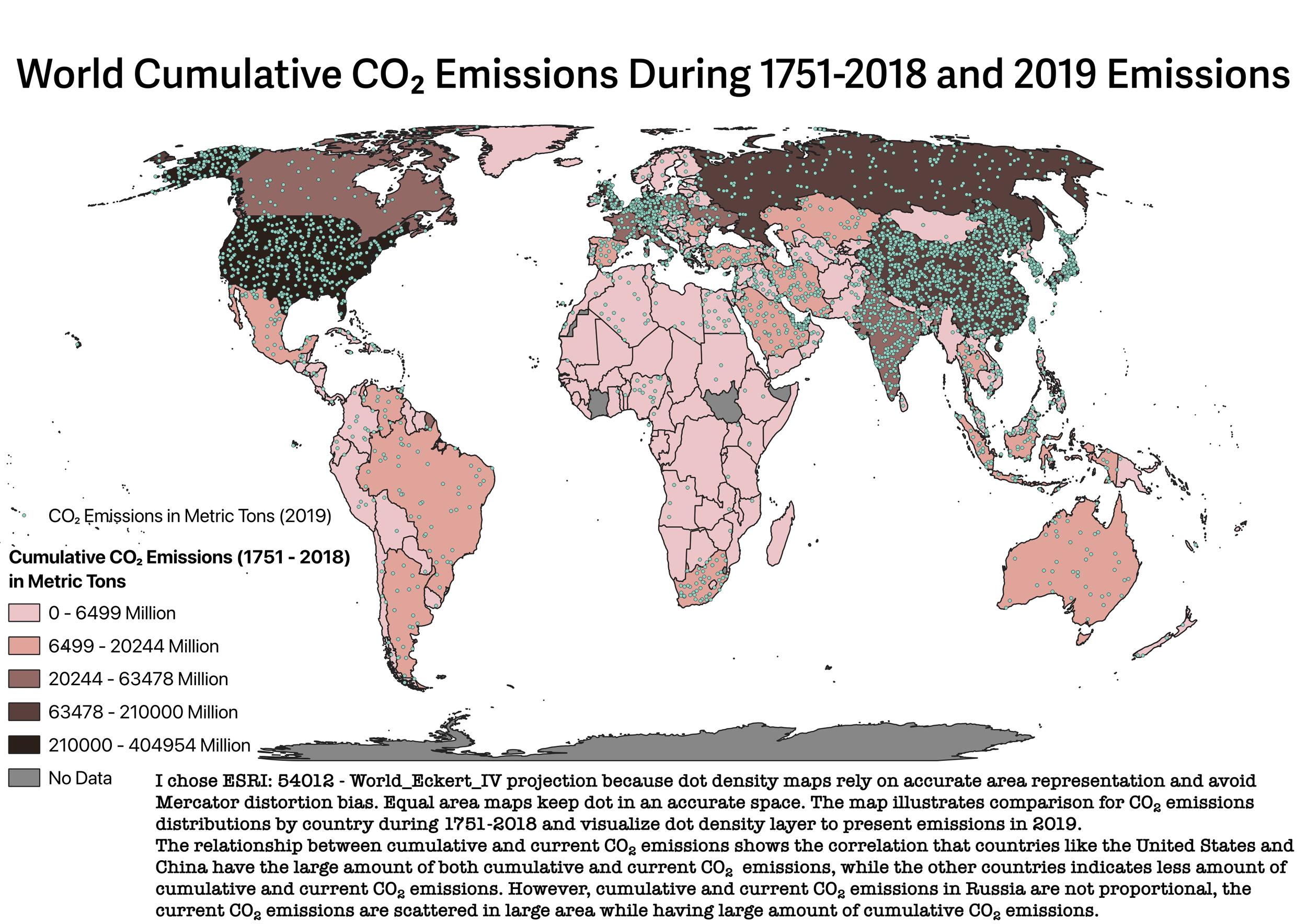
q2. WHICH COUNTRIES HAVE THE LARGEST CARBON FOOTPRINT?
AND HOW ARE CARBON AND OTHER EMISSIONS DISTRIBUTED AROUND THE WORLD?
Map 2
References
Arboretum Foundation. Community Survey. Arboretum Foundation, 2023, https://arboretumfoundation.org/community-survey/. Accessed 10 June 2026.
Seva Workshop. Washington Park Arboretum Survey and Engagement. Seva Workshop, 2023, https://sevaworkshop.com/project/washington-park-arboretum-survey-and-engagement/. Accessed 10 June 2026.
The Cultural Landscape Foundation. Washington Park Arboretum. The Cultural Landscape Foundation, https://www.tclf.org/washington-park-arboretum. Accessed 10 June 2026.
Map 1
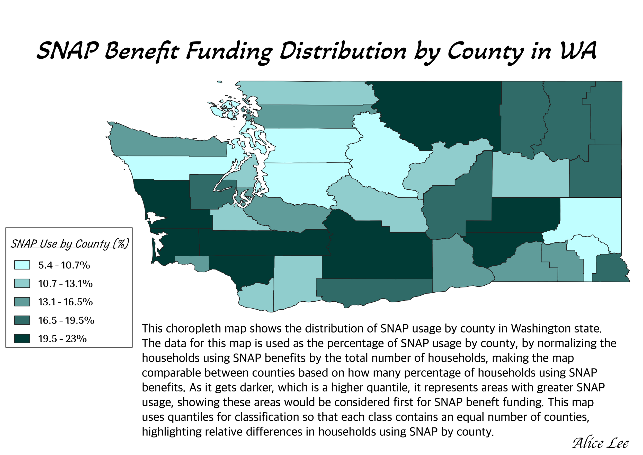
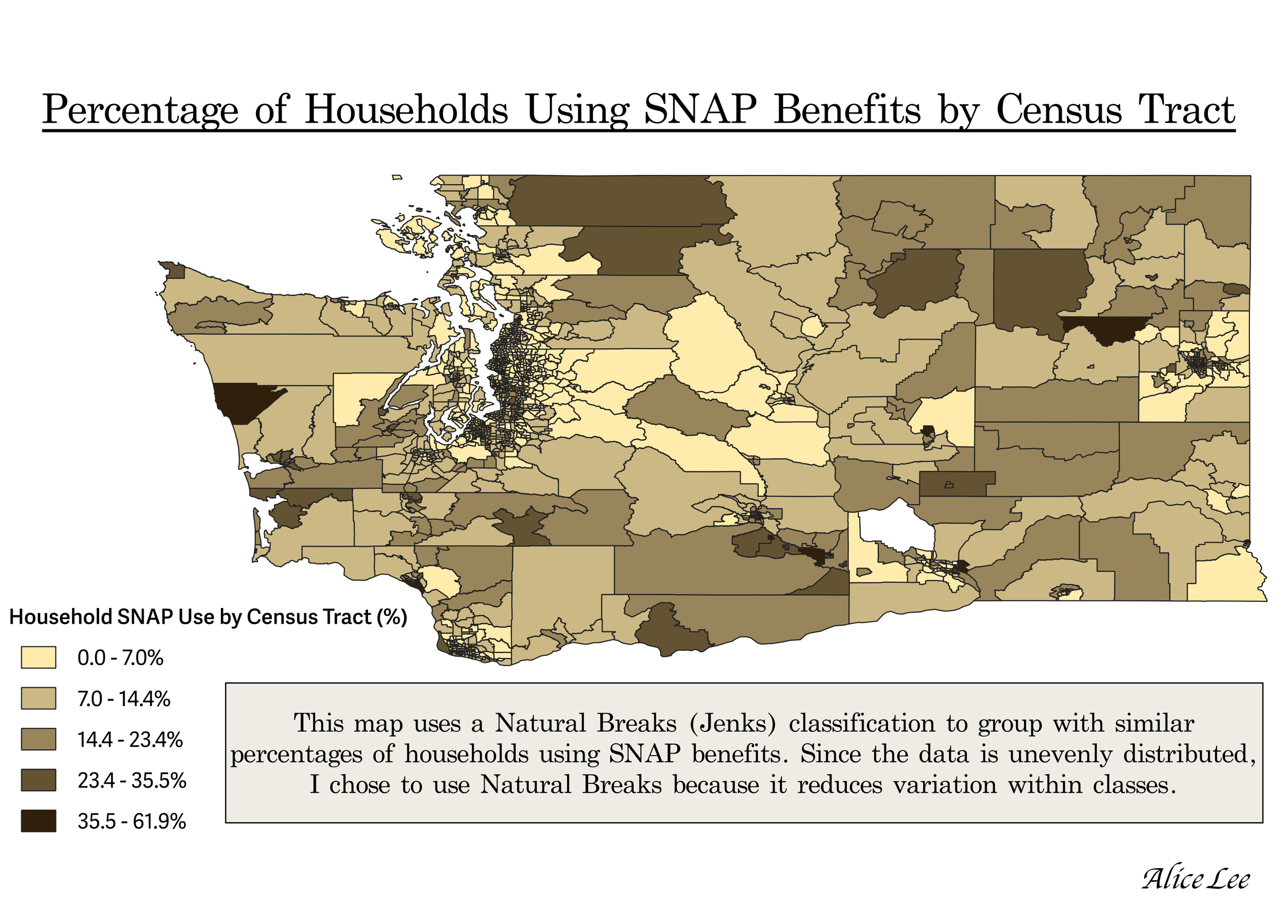
q3. what is the distribution of snap benefit use in washington state?
dIGITAL 3D DESIGN
USING ZBRUSH
rendered of my still life
I created a three-dimensional art inspired by Vanitas style paintings. The five objects on the table are all ones that belong to me, are representative of myself as an individual, and symbolically depict the multifaceted nature of my life.
When placing these objects, I also carefully considered how to create harmony between the colors as well as hues so it could be as pleasing as possible for the viewer. The central quality of this work is it aims to bring a positive feeling into the ordinary elements of daily existence.
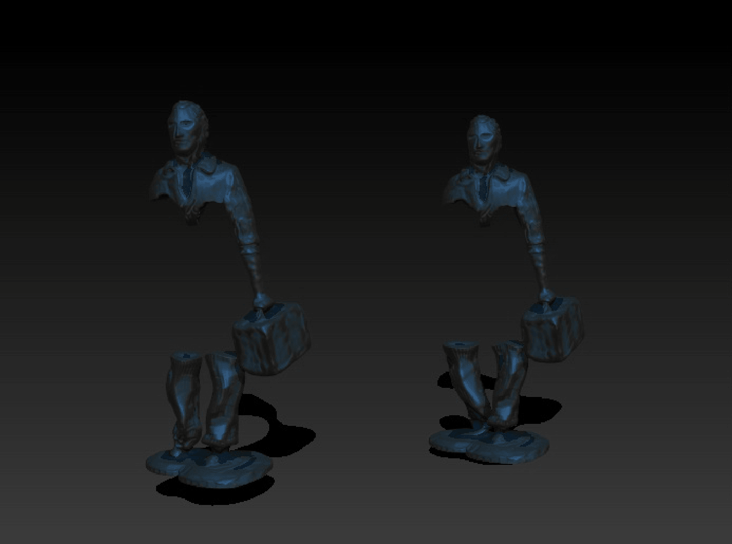
Date of creation: 03/23/2023
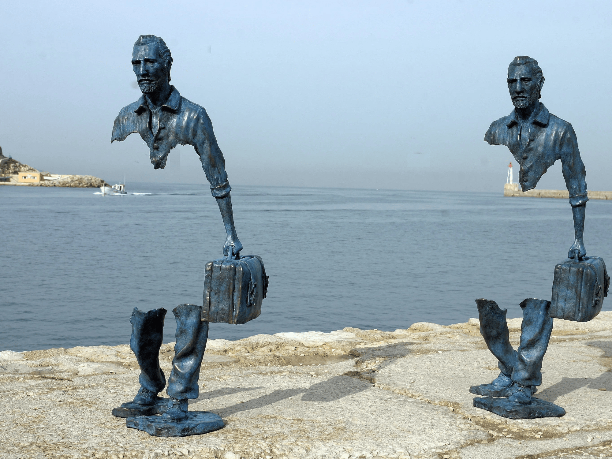
- Les Voyageurs, by French artist
Bruno Catalano, in Marseille, France

mODERN age: the concrete man
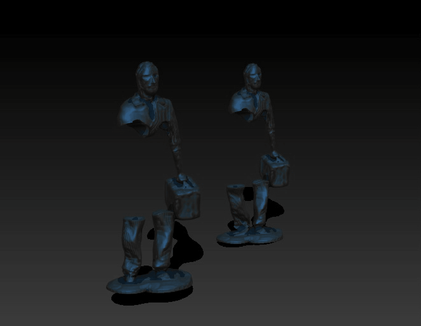
Based on my experiences in Korea, in viewing the daily plight of the Seoul businessman, I was inspired to create a three-dimensional modeling of an interpretation of the well known work Les Voyageurs of Marseille – Por of Fos. In my own work however, instead of a traveler, I wanted to depict the hardship filled voyage through life that the businessman endures. I decided to do a digital medium because I wanted to challenge my skills as a creator on this platform as well make a piece that more accurately represents how the businessman in Seoul is trapped by both his work and his digital screen.